Today we’re very proud to unveil the all-new My Netwise – a completely new customer portal interface that brings your Netwise services together in one secure, easy-to-use platform. Designed to save time and provide greater visibility, My Netwise is the ultimate management portal for looking over your infrastructure, support and account information.
✅ It’s everything Netwise, all in one place.
Built from the ground up with customer experience and operational efficiency in mind, the new My Netwise portal brings everything together in one secure location. Whether you need to raise and track support requests, view service information and utilisation, raise delivery requests, view your billing status, view scheduled maintenance details, or organise access to our facilities, the key information you need is now just a few clicks away.
This launch marks the first step in an ongoing programme of portal enhancements, with new functionality and features already planned. As My Netwise continues to evolve, it will become an even more powerful hub for managing your data centre services, giving you greater visibility, improved self-service capabilities and an even better customer experience.
If you're already a Netwise client, you can login to the new My Netwise portal and try it out for yourself now.
We’ll be taking a closer look at some of the key features of the new portal below.
Why build a new portal?
We’ve been working with our developers and designers since Q4 2024 on this new portal. A full rework of this nature requires close collaboration over a long period of time, with development work starting after several months of UI/UX design iterations, and feasibility studies to ascertain what can be achieved with existing data sources.
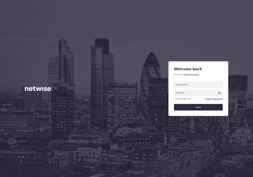
The previous portal put a lot of functionality in your hands, but the user experience had been lacking clear flow and user friendliness, which is something we’ve been keen to fix.
We’d often receive feedback from clients, particularly regarding the poor flow around facility access and user / contact permissions. This has now been fully streamlined, along with all other portal touchpoints, to unify the experience across all core functionality.
We also wanted to unify the look and feel of the portal with the new brand and design language that we implemented on our main website back in 2019. As part of this, we also have a second main site refresh planned that’ll further tie the two main web frontends together.
So what’s new?
In short, everything.
This is a total rebuild, so while we hope it’s familiar to use – thanks to both the much-improved UI/UX and the carried over functionality – it should also feel entirely new, due to the massive improvements made across the board.
Here are some key highlights:
🏠 A new home dashboard – the important bits
When you first land on the new My Netwise portal, you’ll have all of the most important actions and summaries available to you right away.
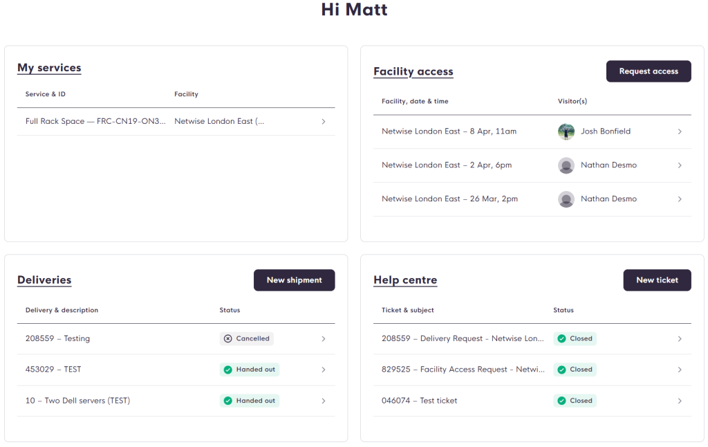
The new home dashboard presents you with four key areas of interest: My Services, Facility Access, Deliveries, and Help Centre.
Each block gives a short overview of your most recent touchpoints, and a button to raise a new action in that particular area instantly, without needing to navigate elsewhere.
👤 Users and Contacts are now Members
We’ve streamlined the previous Users / Contacts area with Members, which will automatically pull across from your existing Users list.
Members of your team can have both email notifications and facility access permissions set at a granular level, enabling better control over who can do what. You can now also set dedicated billing contacts that’ll only receive invoice and payment messages from the system, keeping this better segregated from the more feature-rich Members area.
📱 A new mobile experience
Our previous portal was tricky to use on mobile, which became a pain point for many of our clients who needed access to data and portal functionality on the move.
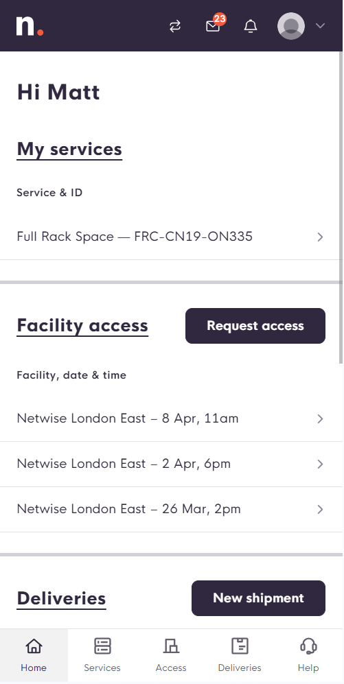
The mobile version of the portal is now a breeze to use, with some notable differences to the full desktop version, such as considerations for navigation reachability while browsing with a single hand.
🔔 Notifications and message history
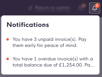
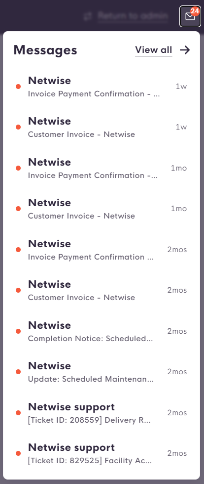
There are now dedicated areas for important notifications, as well as historical messages and system emails.
Notifications provide portal members with a clear visual indication that something requires attention, which helps reduce reliance on system emails as the primary front line. And to expand on system emails, you can now see your entire history of system messages and emails
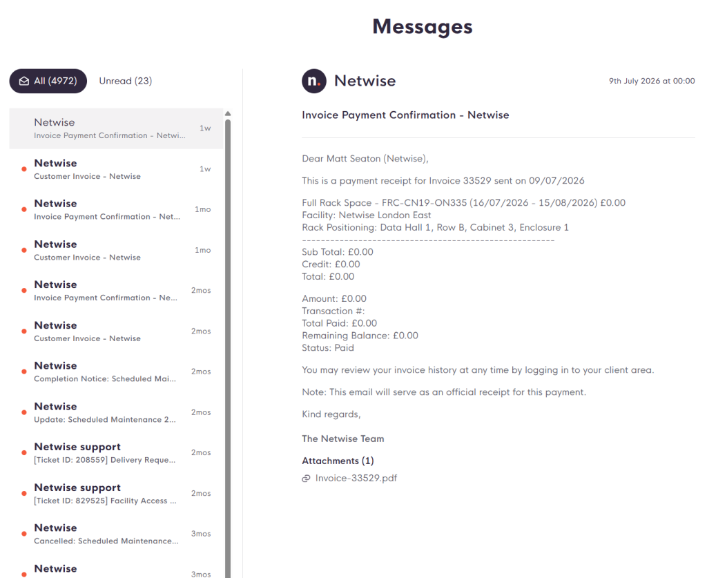
📊 Improved power and connectivity utilisation graphs
One of the most impressive visual changes comes in the form of the new power and connectivity utilisation areas.
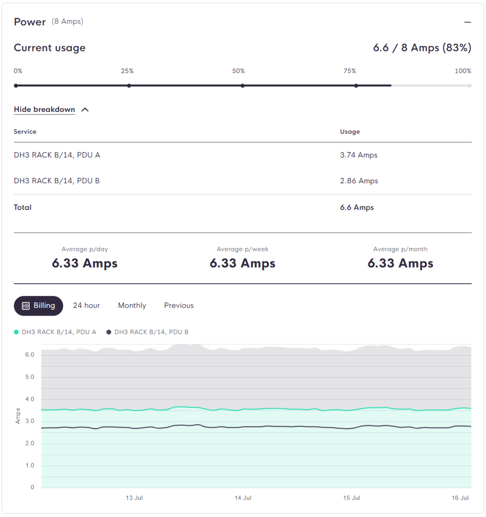
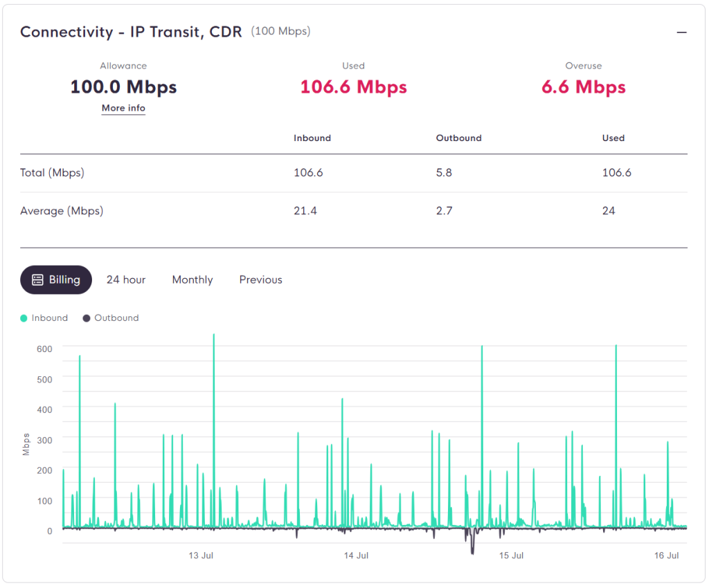
Not only does this new format make for easier reading, but it also provides a greater level of detail, particularly around power utilisation for specific PDUs (or outlets for shared per unit clients).
🆘 Help centre – your new home for support
The new help centre is now your one-stop-shop for all support related touchpoints.
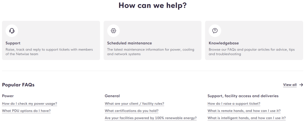
Here you’ll find three main areas:
Support, which is for tickets, with a much more user-friendly flow.
Scheduled maintenance, which covers active and historical maintenance and faults, and now also has functionality to filter by those only relevant to your deployment location(s).
Knowledgebase, which has been expanded and covers a wider range of topics, and which will be built out further over time.
Each block gives a short overview of your most recent touchpoints, and a button to raise a new action in that particular area instantly, without needing to navigate elsewhere.
A new base for the future
Having our new portal launched provides a great foundation for the next phase of feature additions, which are already in the works.
One of the first additions we’re planning is a Collections function, to work in the same fashion as Deliveries, to streamline the process for client returns.
Beyond this, we have longer term ambitions to integrate further data points from our monitoring platform, such as location-specific environmental readings, and even real-time PUE calculations.
Watch this space for new feature rollouts in the future.
Give it a try
We’re confident that our new UI/UX is intuitive enough to simply dive in and start using it, so why not login and give it a try!
You’ll also see a helpful guide to where to find the main features of the new portal when you first login.
If you have any feedback for us, feel free to open a ticket, or email your usual point of contact directly with any notes (good and bad welcome!).